100 Midjourney Prompts That Actually Work
Last Updated: 2026-01-22 18:07:40
Most Midjourney prompts look impressive and then completely fall apart when you actually use them.
They either sound artistic but produce random results, or they’re so tightly engineered that they work once and never again. This guide focuses on the narrow middle ground: prompts that hold up across multiple runs and give you something you can reliably build on.
If you’re expecting a single “perfect prompt,” you won’t find it here. If you want repeatable results and a realistic understanding of Midjourney V6.1, this is where to start.
Before You Start: V6.1 Changes Everything
If you're still using V5 or V6, stop. V6.1 handles prompts completely differently, and about 40% of the old "best practices" advice floating around will actually make your images worse.
Here's what changed:
- Natural language works better now - You don't need to pack every keyword like it's 2010 SEO
- Default stylize is lower - Old prompts with --s 750 will look over-processed in V6.1
- Better text rendering - You can finally get readable text in images (sometimes)
- Photorealism is easier - Less "AI art" look by default
Always add --v 6.1 to your prompts. The default might still be V6 depending on when you signed up, and trust me, you'll wonder why your results look different from examples you see online.
How to Actually Write Prompts (No Fluff)
Every Midjourney guide tells you the same thing: describe what you want clearly. Great advice. Completely useless without context.
Here's what actually matters, in order of importance:
1. Subject (What you want) - The obvious part
Be specific but not obsessive. "Woman in office" is too vague. "Professional woman in modern office, natural window light" works. "Professional woman aged 32 with shoulder-length brown hair in modern minimalist office with three windows..." is overkill and will actually confuse the AI.
2. Style/Medium (How it should look) - This changes everything
The difference between "cat" and "cat, oil painting" is massive. Some styles that work well:
- Photography: Just say "photography" or specify camera ("shot on Canon R5, 85mm")
- Illustration: "digital illustration", "watercolor", "vector art"
- Realistic: "photorealistic", "hyper-realistic" (V6.1 default is already pretty realistic)
- Artistic: "impressionist", "art nouveau", "minimalist"
3. Lighting (Often forgotten, huge impact)
Adding "golden hour", "studio lighting", or "dramatic shadows" will improve 90% of images. For product shots, "soft diffused lighting" is your friend. For portraits, "natural window light" rarely disappoints.
4. Parameters (The technical stuff)
Parameters go at the end. Most important: --ar for aspect ratio (--ar 16:9 for landscape, --ar 2:3 for portrait), --v 6.1 for the latest version, and --stylize if you want more or less AI interpretation (default is 100, lower is more literal, higher is more artistic).
5 Mistakes Everyone Makes (And How to Fix Them)
Mistake #1: Using Negative Prompts for Everything
The --no parameter seems powerful until you realize it doesn't work like you think. "--no blur" doesn't guarantee sharp images. It just tells Midjourney "try to avoid blur" while also confusing the composition. Better approach: Instead of "--no blur", use "sharp focus, crystal clear, high detail" in your main prompt. Save --no for obvious problems like "--no text" when you don't want random words appearing.
Mistake #2: Overloading with Keywords
I see this constantly: "beautiful stunning gorgeous amazing breathtaking masterpiece 8K ultra HD photorealistic..." Stop. V6.1 doesn't need this. One quality descriptor is enough. "Professional photography" tells the AI more than ten synonyms for "good."
Mistake #3: Ignoring Aspect Ratios
Square images (default 1:1) rarely look professional for anything except Instagram posts and profile pictures. Use --ar 16:9 for YouTube thumbnails and web banners, --ar 3:2 for general photography, --ar 4:5 for Instagram portraits, --ar 9:16 for vertical content. Wrong aspect ratio = wrong composition every time.
Mistake #4: Not Iterating
Your first prompt will almost never give you the perfect result. That's normal. Generate four variations, pick the best, then use the Vary (Strong) or Vary (Subtle) buttons. This is faster than rewriting prompts constantly. I typically go through 3~5 iterations before I'm happy with an image.
Mistake #5: Copying Prompts Exactly
Prompts from online collections (including this one) are starting points, not copy-paste solutions. Same prompt = similar images, but Midjourney adds randomness on purpose. You'll need to adjust based on what you actually want. Think of these as recipes you can modify, not exact formulas.
The Prompts (Tested and Working)
I've organized these by use case instead of arbitrary categories. Each prompt includes what it's actually good for and common issues you might run into.
Professional Photography & Portraits
For headshots, LinkedIn photos, team pages:
professional business headshot, neutral gray background, soft studio lighting, confident expression, sharp focus --ar 4:5 --v 6.1
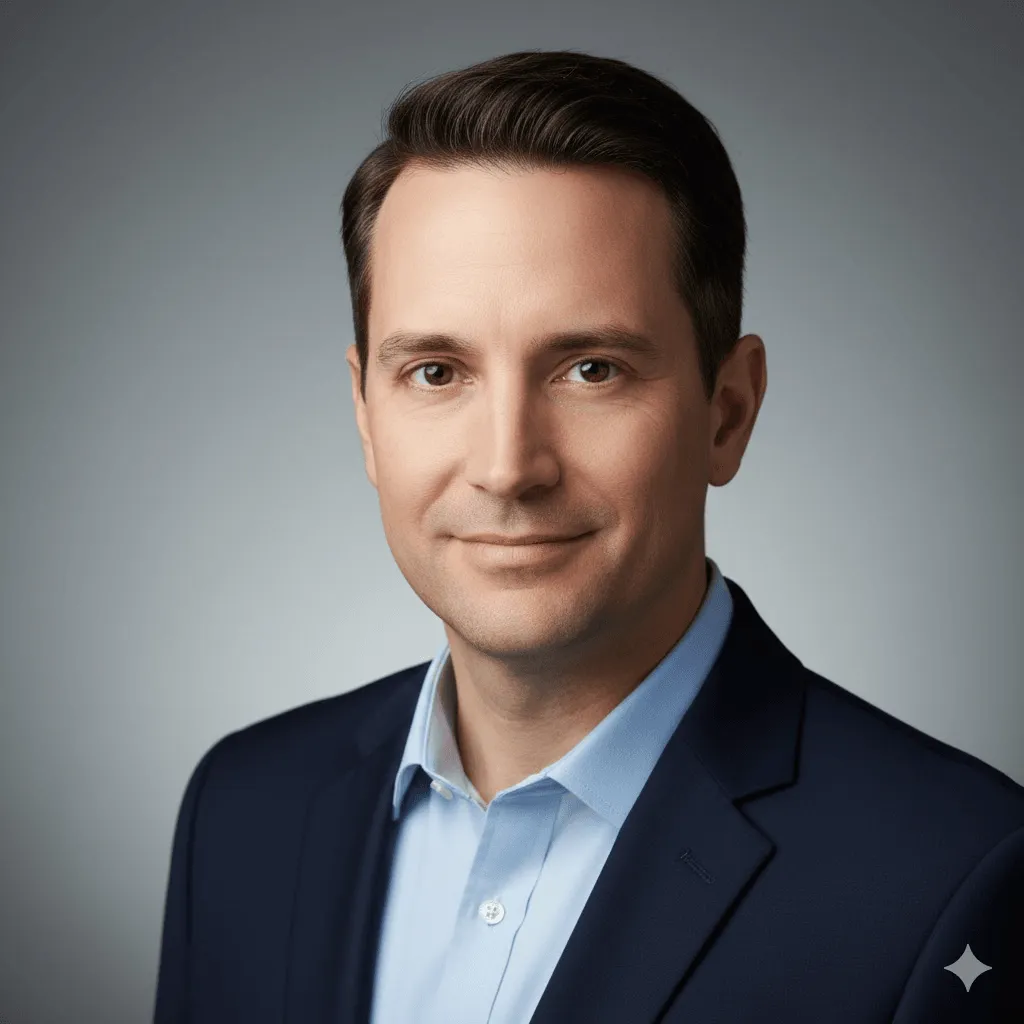
What works: Clean, professional results. White or gray backgrounds consistently good.
Watch out: Sometimes adds suit jackets even if you don't specify. If you want casual, say "casual clothing" explicitly.
candid lifestyle portrait, natural outdoor lighting, genuine smile, shallow depth of field, environmental context --ar 3:4 --v 6.1
editorial fashion portrait, dramatic side lighting, high contrast, sophisticated mood, magazine quality --ar 2:3 --v 6.1 --stylize 300
environmental portrait at workplace, authentic moment, natural window light, professional atmosphere, documentary style --ar 16:9 --v 6.1
golden hour outdoor portrait, warm backlight, lens flare, genuine emotion, lifestyle photography --ar 4:5 --v 6.1
Product Photography & E-commerce
For product listings, catalogs, ads:
product photography, white background, soft even lighting, centered composition, commercial quality --ar 1:1 --v 6.1
Pro tip: Add product type ("wireless headphones" or "ceramic mug") for better results. Generic "product" can be hit or miss.
luxury product shot, dark moody background, dramatic side lighting, premium aesthetic, advertising photography --ar 4:5 --v 6.1 --stylize 200
lifestyle product shot, natural setting, authentic use case, morning sunlight, Instagram aesthetic --ar 4:5 --v 6.1
overhead flat lay product arrangement, minimal styling, clean composition, bright natural light --ar 1:1 --v 6.1
product in use, hands holding item, authentic interaction, soft focus background, lifestyle commercial --ar 16:9 --v 6.1
Food & Restaurant Photography
overhead food photography, rustic wooden surface, natural daylight, fresh ingredients, editorial food styling --ar 4:5 --v 6.1
Reality check: Steam effects are unreliable. If you need visible steam, generate without it and add in post.
restaurant plating, fine dining presentation, dramatic lighting, shallow depth of field, gourmet food photography --ar 3:4 --v 6.1
casual cafe scene, coffee and pastry, warm morning light, inviting atmosphere, lifestyle food shot --ar 1:1 --v 6.1
artisan bread close-up, texture detail, flour dust, warm bakery lighting, rustic aesthetic --ar 4:3 --v 6.1
Architecture & Interior Design
modern interior design, minimalist aesthetic, natural light, clean lines, architectural photography --ar 16:9 --v 6.1
luxury hotel lobby, grand architecture, ambient lighting, sophisticated atmosphere, hospitality design --ar 3:2 --v 6.1
cozy living room, scandinavian design, afternoon sunlight, comfortable furniture, hygge aesthetic --ar 4:3 --v 6.1
contemporary office space, open floor plan, natural materials, professional environment --ar 16:9 --v 6.1
modern building exterior, architectural detail, golden hour light, urban context, real estate photography --ar 2:3 --v 6.1
Landscapes & Travel Photography
mountain landscape photography, dramatic clouds, golden hour, wide angle view, nature photography --ar 16:9 --v 6.1
tropical beach scene, turquoise water, white sand, palm trees, travel photography --ar 21:9 --v 6.1
ancient forest, misty atmosphere, rays of light through trees, ethereal mood, landscape photography --ar 3:4 --v 6.1
desert landscape, sand dunes, dramatic shadows, minimalist composition, golden hour --ar 16:9 --v 6.1
coastal cliffs, ocean waves, dramatic sky, seascape photography, long exposure effect --ar 3:2 --v 6.1
Urban & Street Photography
rainy city street at night, neon reflections, urban atmosphere, cinematic lighting --ar 16:9 --v 6.1 --stylize 250
This prompt works great for cyberpunk aesthetics without saying "cyberpunk" (which can be overused).
bustling city intersection, motion blur, urban energy, documentary style, street photography --ar 3:2 --v 6.1
modern architecture, geometric patterns, minimalist composition, urban photography --ar 4:5 --v 6.1
empty city street at dawn, soft light, urban solitude, cinematic atmosphere --ar 21:9 --v 6.1
urban alley with street art, vibrant colors, contemporary culture, documentary photography --ar 9:16 --v 6.1
Characters & Concept Art
fantasy character design, detailed costume, dramatic lighting, concept art style, digital painting --ar 2:3 --v 6.1 --stylize 400
sci-fi character portrait, futuristic elements, cinematic lighting, concept art quality --ar 4:5 --v 6.1 --stylize 350
anime style portrait, expressive eyes, vibrant colors, cel shading, clean line art --ar 3:4 --v 6.1 --niji 6
Note: Use --niji 6 specifically for anime/manga styles. Regular V6.1 doesn't handle this style well.
character concept sheet, multiple angles, design details, professional character art --ar 16:9 --v 6.1 --stylize 300
stylized portrait illustration, bold colors, graphic design aesthetic, modern art style --ar 1:1 --v 6.1 --stylize 500
Abstract & Artistic Styles
abstract fluid art, flowing colors, organic shapes, vibrant gradients, contemporary art --ar 1:1 --v 6.1 --stylize 600
minimalist geometric composition, limited color palette, clean design, modern art --ar 2:3 --v 6.1 --stylize 200
watercolor painting, soft edges, artistic interpretation, gentle colors, traditional medium --ar 4:5 --v 6.1 --stylize 450
impressionist landscape, loose brushstrokes, light and color, classical art style --ar 16:9 --v 6.1 --stylize 500
pop art style, bold colors, graphic elements, contemporary aesthetic, andy warhol inspired --ar 1:1 --v 6.1 --stylize 400
Wildlife & Nature Close-ups
wildlife portrait, shallow depth of field, natural habitat, golden hour lighting, national geographic style --ar 4:5 --v 6.1
macro nature photography, extreme close-up, intricate detail, soft natural light --ar 1:1 --v 6.1
underwater marine life, vibrant coral reef, tropical fish, clear blue water, diving photography --ar 16:9 --v 6.1
bird in flight, wings spread, action shot, blue sky background, wildlife photography --ar 3:2 --v 6.1
butterfly macro, detailed wing patterns, natural setting, soft bokeh background --ar 4:5 --v 6.1
Logos, Branding & Graphics
Reality check: Midjourney isn't great for final logos, but excellent for concept exploration.
minimalist logo design, geometric shapes, monochrome, scalable, professional branding --ar 1:1 --v 6.1 --stylize 150
modern tech logo concept, clean lines, abstract symbol, innovative feel --ar 1:1 --v 6.1 --stylize 200
organic nature-inspired logo, flowing forms, natural colors, eco-friendly aesthetic --ar 1:1 --v 6.1 --stylize 300
luxury brand emblem, elegant typography, gold accents, sophisticated design --ar 1:1 --v 6.1 --stylize 250
playful mascot character, friendly expression, simple shapes, brand identity --ar 1:1 --v 6.1 --stylize 350
Parameters That Matter (And Ones That Don't)
Let me be honest: most parameters you can ignore. Here are the ones you'll actually use regularly, with real talk about what they do.
Parameter | What It Does | When to Use |
--v 6.1 | Uses latest model | Always. Unless testing older versions. |
--ar | Sets aspect ratio | 16:9 for web/presentations, 4:5 for Instagram, 2:3 for prints |
--stylize | AI interpretation level | Lower (50-150) for product shots, higher (400-700) for art |
--no | Excludes elements | --no text, --no people (use sparingly, not reliable) |
--chaos | Variation between results | Rarely needed. Default gives enough variety. |
--niji 6 | Anime/manga style | Only for anime art. Don't mix with --v 6.1 |
What Didn't Make This List (And Why)
I tested way more prompts than what's here. Some didn't make the cut because:
- Too inconsistent - Results varied wildly between attempts
- Overly complex - Required so many specific elements they only worked once
- Style-specific artist names - Legal gray area, plus they don't age well
- Redundant - Too similar to prompts already included
Also skipped: Ultra-specific prompts like "a giraffe wearing a top hat playing chess in a hot air balloon." Fun to look at online, useless for actual work. If you need something that specific, you're better off doing multiple generations and compositing in Photoshop.
When Things Go Wrong (Troubleshooting)
Problem: Images look blurry or low quality
Solution: Add "sharp focus", "high detail", or "crystal clear" to your prompt. If still blurry, the subject might be too complex for the aspect ratio. Try a simpler composition or larger dimensions.
Problem: Wrong colors or mood
Solution: Be more specific about color palette ("warm tones", "cool blues", "muted pastels") and mood ("professional", "playful", "dramatic"). Lighting descriptions also affect mood heavily.
Problem: Too much or too little AI "style"
Solution: Adjust --stylize parameter. Default is 100. Go to 50-150 for more literal interpretation, 300-600 for more artistic. Above 700 gets weird fast.
Problem: Random text appearing in images
Solution: Add --no text to your prompt. V6.1 is better about this than previous versions, but it still happens occasionally, especially in urban scenes and product shots.
Problem: Can't get consistent character/style
Solution: Use the same seed number (find it using the envelope emoji reaction on your image in Discord, then add --seed [number] to your prompt). This helps but doesn't guarantee identical results. For true consistency, you need to use character reference features (--cref) which is beyond scope here.
Real Talk: What Midjourney Can't Do (Yet)
Let's address the elephant in the room. Midjourney is incredible, but it has limits:
- Hands are still weird sometimes - Better in V6.1, but complex hand positions can still look off
- Text consistency is improving but not perfect - Short text works okay, longer text or specific fonts are unreliable
- Exact composition control is limited - You can guide it, but pixel-perfect composition requires multiple attempts
- Complex multi-object scenes are tricky - The more elements you add, the more likely something will be off
- Photorealistic faces need careful prompting - Generic "person" can look artificial. More specific descriptions help
If your project needs pixel-perfect accuracy, plan for post-processing. Midjourney is best as a starting point or for concepting, not as a replacement for photography or illustration when precision matters.
Questions I Get Asked Constantly
Q: Do I need Discord or can I use the web interface?
Either works. Web interface (alpha.midjourney.com) is cleaner and easier for beginners. Discord has more features and feels faster once you're used to it. I use web for quick tests, Discord for serious work.
Q: How many variations should I generate before giving up?
If you're not getting anywhere close after 3-4 attempts, your prompt needs work, not more variations. Change your description, try different parameters, or simplify what you're asking for. More generations of a bad prompt won't help.
Q: Can I use these images commercially?
With a paid subscription, yes. Free trial users have limited rights. Always check Midjourney's current Terms of Service. Also, if you're using images of recognizable people, brands, or copyrighted characters, that's a separate legal issue regardless of Midjourney's terms.
Q: Why do my results look different from yours/examples online?
Midjourney adds randomness to every generation. Same prompt will give you similar but not identical results. Also check you're using the right version (--v 6.1) and that your other parameters match. Small wording differences also change output more than you'd expect.
Q: Should I learn all the parameters and features?
No. Master the basics first: good descriptions, aspect ratios, and the stylize parameter. That covers 90% of use cases. Advanced features like seeds, permutations, and style references are nice but not essential. Learn them when you actually need them.
My Actual Workflow (What I Really Do)
Here's my honest process when I need an image:
Step 1: Start simple
I describe what I want in one sentence, add a style if needed, set aspect ratio. That's it. No fancy parameters yet. Generate and see what happens.
Step 2: Pick the best direction
Of the four results, one is usually closer to what I want. I click that and use Vary (Strong) or Vary (Subtle) depending on how close it is. This is faster than rewriting the whole prompt.
Step 3: Adjust if needed
If variations aren't cutting it, I modify the original prompt. Add lighting details, adjust the style descriptor, change --stylize if it's too artistic or too literal. Generate again.
Step 4: Upscale and export
Once I have something good, I upscale (the U buttons). Then download and do minor touch-ups in Photoshop if needed. Most images need at least small adjustments for professional use.
Total time: Usually 5~15 minutes for a good result. Sometimes longer if it's a complex concept or I'm being picky. Very rarely do I get what I want on the first try, and that's normal.
Final Thoughts: Use These as Starting Points
These 100 prompts aren't magic formulas. They're templates you can modify based on what you actually need. Take the structure, adjust the subject and details, test different parameters.
The best prompt is the one that gets you closest to your vision in the fewest attempts. Sometimes that's a complex, detailed description. Sometimes it's five words and --ar 16:9.
Keep a document of prompts that work for you. Copy successful ones and modify them for new projects. Over time, you'll develop your own style of prompting that fits how you think and what you create.
Midjourney is a tool, not a replacement for creative thinking. The AI generates pixels, but you decide what's worth making and how to use it. That's still the most important part.
Bonus: Quick Wins and Time-Savers
- Save successful prompts in a note - You'll reuse them more than you think
- Use the remix feature - Enables prompt editing between variations
- Check the Explore page - See what others are making and what prompts they used
- Learn keyboard shortcuts - Makes Discord workflow much faster
- Use /describe on existing images - Reverse engineer good prompts from images you like
- Join the Midjourney Discord community - Tons of helpful people sharing tips
- Test on low settings first - When experimenting, use fast mode to save credits
That's it. Now go make something interesting.